- The height of the bar corresponds to the frequency
- The width of the bar extends to the real limits of the score (interval)
In ViSta, these intervals are called "BINS".
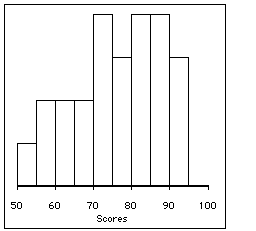
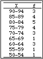
Note that the histogram shown here (which is produced by ViSta) does not have exactly the same intervals as the table, resulting in different frequencies.
This is because the histogram follows somewhat different rules for constructing intervals than those given above (which are used for the table).
Since the rules are somewhat arbitrary, neither the plot nor the table are "wrong". They're just different. However, for homework problems from the book we should follow the rules given in the book.
Also, recall the fact that different intervals (bins) produce histograms that can look very different. Some may be misleading, but we don't really know which.
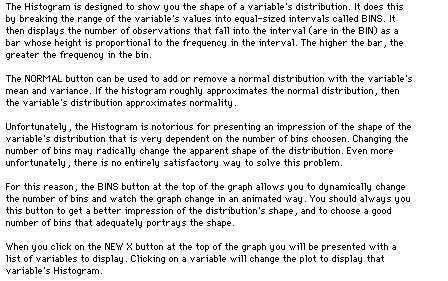
Here is ViSta's help information for Histograms:
ViSta does not yet do frequency plots.
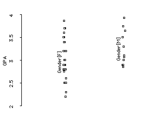
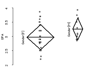
This boxplot shows the same data as used for the histogram and frequency plot.
This boxplot shows the same data as used for the histogram and frequency plot.
Here is ViSta's help information for Box, Diamond and Dot plots:

This frequency plot shows the same data as used for the histogram (and has the same intervals).