The correlation requires two scores from the same individuals. These scores are normally identified as X and Y. The pairs of scores can be listed in a table or presented in a scatterplot.
Example: We might be interested in the correlation between your SAT-M scores and your GPA at UNC.
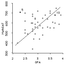
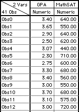
Here are the Math SAT scores and the GPA scores of 13 of the students in this class, and the scatterplot for all 41 students:
|
|
|
The scatterplot has the X values (GPA) on the horizontal (X) axis, and the Y values (MathSAT) on the vertical (Y) axis. Each individual is identified by a single point (dot) on the graph which is located so that the coordinates of the point (the X and Y values) match the individual's X (GPA) and Y (MathSAT) scores.
For example, the student named "Obs5" (in the sixth row of the datasheet) has GPA=2.30 and MathSAT=710. This student is represented in the scatterplot by high-lighted and labled ("5") dot in the upper-left part of the scatterplot. Note that is to the right of MathSAT of 710 and above GPA of 2.30.
Note that the Pearson correlation (explained below) between these two variables is .32.
- The Direction of a Relationship The correlation measure tells us about the direction of the relationship between the two variables. The direction can be positive or negative.
- Positive : In a positive relationship both variables tend to move in the same direction: If one variable increases, the other tends to also increase. If one decreases, the other tends to also.
- Negative : In a negative relationship the variables tend to move in the opposite directions: If one variable increases, the other tends to decrease, and vice-versa.
- The Form (Shape) of a Relationship : The form or shape of a relationship refers to whether the relationship is straight or curved.
- Linear : A straight relationship is called linear, because it approximates a straight line. The GPA, MathSAT example shows a relationship that is, roughly, a linear relationship.
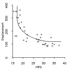
- Curvilinear : A curved relationship is called curvilinear, because it approximates a curved line. An example of the relationship between the Miles-per-gallon and engine displacement of various automobiles sold in the USA in 1982 is shown below. This is curvilinear (and negative).
- The Degree (Strength) of a Relationship
- Perfect Relationship : When two variables are exactly (linearly) related the correlation coefficient is either +1.00 or -1.00. They are said to be perfectly linearly related, either positively or negatively.
- No relationship : When two variables have no relationship at all, their correlation is 0.00.
In the example above, GPA and MathSAT are positively related. As GPA (or MathSAT) increases, the other variable also tends to increase.
The direction of the relationship between two variables is identified by the sign of the correlation coefficient for the variables. Postive relationships have a "plus" sign, whereas negative relationships have a "minus" sign.
In this course we only deal with correlation coefficients that measure linear relationship. There are other correlation coefficients that measure curvilinear relationship, but they are beyond the introductory level.
Finally, a correlation coefficient measures the degree (strength) of the relationship between two variables. The mesures we discuss only measure the strength of the linear relationship between two variables. Two specific strengths are:
There are strengths in between -1.00, 0.00 and +1.00. Note, though. that +1.00 is the largest postive correlation and -1.00 is the largest negative correlation that is possible. Here are three examples:
Weight and Horsepower
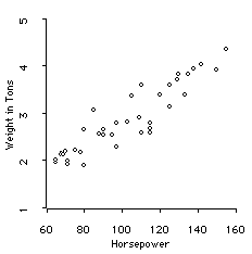
The relationship between Weight and Horsepower is strong, linear, and positive, though not perfect. The Pearson correlation coefficient is +.92.
Drive Ratio and Horsepower
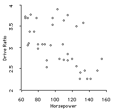
The relationship between drive ratio and Horsepower is weekly negative, though not zero. The Pearson correlation coefficient is -.59.
Drive Ratio and Miles-Per-Gallon
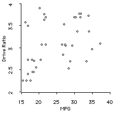
The relationship between drive ratio and MPG is weekly positive, though not zero. The Pearson correlation coefficient is .42.
- Prediction : Correlations can be used to help make predictions. If two variables have been known in the past to correlate, then we can assume they will continue to correlate in the future. We can use the value of one variable that is known now to predict the value that the other variable will take on in the future.
- Validity : Suppose we have developed a new test of intelligence. We can determine if it is really measuring intelligence by correlating the new test's scores with, for example, the scores that the same people get on standardized IQ tests, or their scores on problem solving ability tests, or their performance on learning tasks, etc.
- Reliability : Correlations can be used to determine the reliability of some measurement process. For example, we could administer our new IQ test on two different occasions to the same group of people and see what the correlation is. If the correlation is high, the test is reliable. If it is low, it is not.
- Theory Verification : Many Psychological theories make specific predictions about the relationship between two variables. For example, it is predicted that parents and children's intelligences are positively related. We can test this prediction by administering IQ tests to the parents and their children, and measuring the correlation between the two scores.
For example, we require high school students to take the SAT exam because we know that in the past SAT scores correlated well with the GPA scores that the students get when they are in college. Thus, we predict high SAT scores will lead to high GPA scores, and conversely.
This is a process for validating the new test of intelligence. The process is based on correlation.