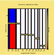
Chapter 5: Seeing Frequency Data analyzes data about admissions in Berkeley.
| This figure the mosaic plot for the Berkeley data. The color of the cells stem from residuals of the model [Gender Department] [Admission Department]. It is clear that this model does not fit well for Department A that has the largest residuals in the mosaic display. |
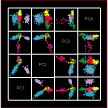
Chapter 8: Seeing Multivariate Data presents many graphs that analyze the clusters in data about Psoriasis symptoms. Some of the plots in the book are displayed here using colors for the different groups, black backgrounds and in vector format. We believe that they are gorgeous and we expect you will enjoy them too.
| This figure shows a scatterplot matrix of the first four principal components of the analysis of the symptoms of psoriasis. Selecting and changing the color of the points, as discussed in the examples chapter, it is possible to discriminate between the six clusters. Look at the PC1 v. PC4 to see the six clusters without much overlapping. | |
| This figure corresponds to Figure 8.27 of the book. It shows the six diagnostic groups using different colors. The figure displays very clearly the structure but two of the groups present some overlap. | |
|
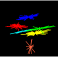
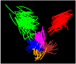
This figure is an orbitplot with orbit trails added. The six groups are identified with colors. We see that the path of the points differs between groups but there is some overlapping. It is interesting that you can identify some outliers in the plot because their paths are different from the path of the other points in their clusters. |
|
This orbitplot only displays three groups with clarity. |
|
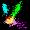
This orbitplot is the one shown in the cover of the book and repeated in Figure 8.17 with colors added. The three main groups are displayed very clearly, but we can not see very well the fine structure in the cluster located in the low part of the plot. |
Other Figures : I have been working in the capability saving .pdf files directly from ViSta. These are the results of my experiments
|
|
Do you think that these plots are apt for publication? Hint: If you want to use them in Word documents at the maximum quality, print them as files to a postscript printer (or use other way to create .eps files), turn the extension .ps to .eps and then insert it as a graphic into Word. This works seamlessly in Word 2007. On the other hand, you may import them into Word as Acrobat objects. However, Word seems to render them quite poorly so you may be disappointed by the result. Of course, if you use OpenOffice with the Sun PDF Import Extension, LaTeX or Framemaker things you can just use the .pdf file as is. |
Last update 11-jan-10