The book portrays small images placed in the corners of the pages in such way that the reader can "thumb" to animate them. Some of these animations are shown here. (Note: after clicking in the animations use the Back button of your browser to return to this page)
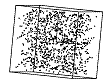
| Marsaglia (1968) wrote a paper about the RANDU random number generator showing that it produced wrong results. Wainer and Velleman (2001) wrote a paper that used dynamic spinplots to display visually the lack of randomness of data generated using RANDU. This spinplot is in chapter 1 of the Visual Statistics book and can be seen rotating here. Can you see when the nonrandomness is revealed? | |
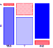
| The dynamic visualization of the steps of fitting a loglinear model to frequency data shows how the residuals of the mosaic display turn progresively white from red/blue. In this example, the proportions of Males and Females saying 'Yes', "Don't know", and 'No' vary from frame to frame. The tiles are shaded more to the extent that Gender is associated with the response. The process of fitting loglinear models and how to use mosaic displays for visualizing it is described in Chapter 5: Frequency Data |
Last update 8/10/06