Plots
Visual examples of every plot currently available in LinkEDA.
Plot menu · visual reference
Plot examples
The native captures show LinkEDA itself. The remaining examples were generated reproducibly in R from mtcars or airquality, using the variables and panel structures accepted by the corresponding LinkEDA plot.
Main plots
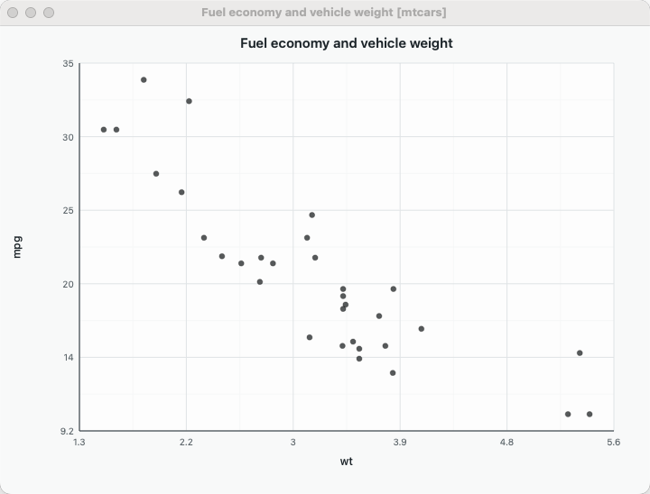
Scatterplot…
Native capture ·mtcars: mpg × wt
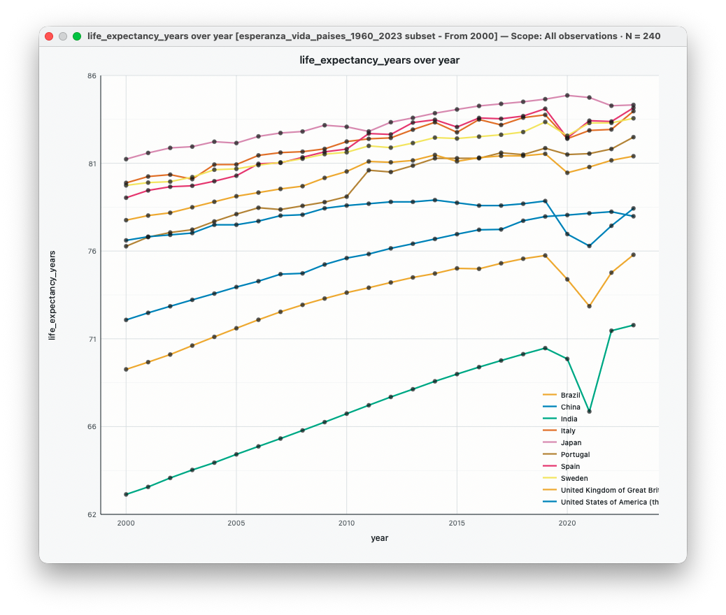
Time Series…
R example ·airquality: Day, Temp, series Month
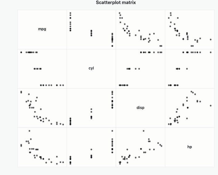
Scatterplot Matrix…
R example ·mtcars: mpg, wt, hp, qsec
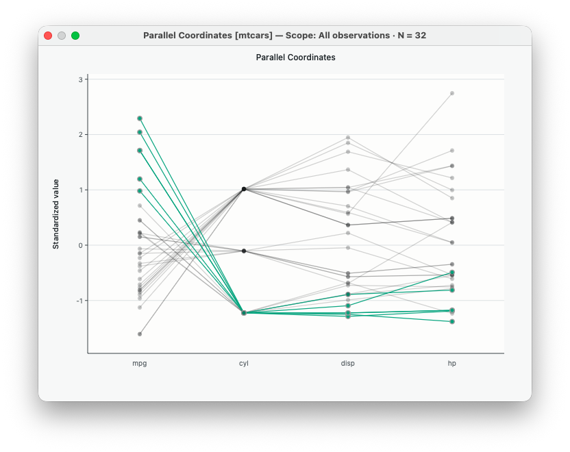
Parallel Coordinates…
R example · six standardizedmtcars variables
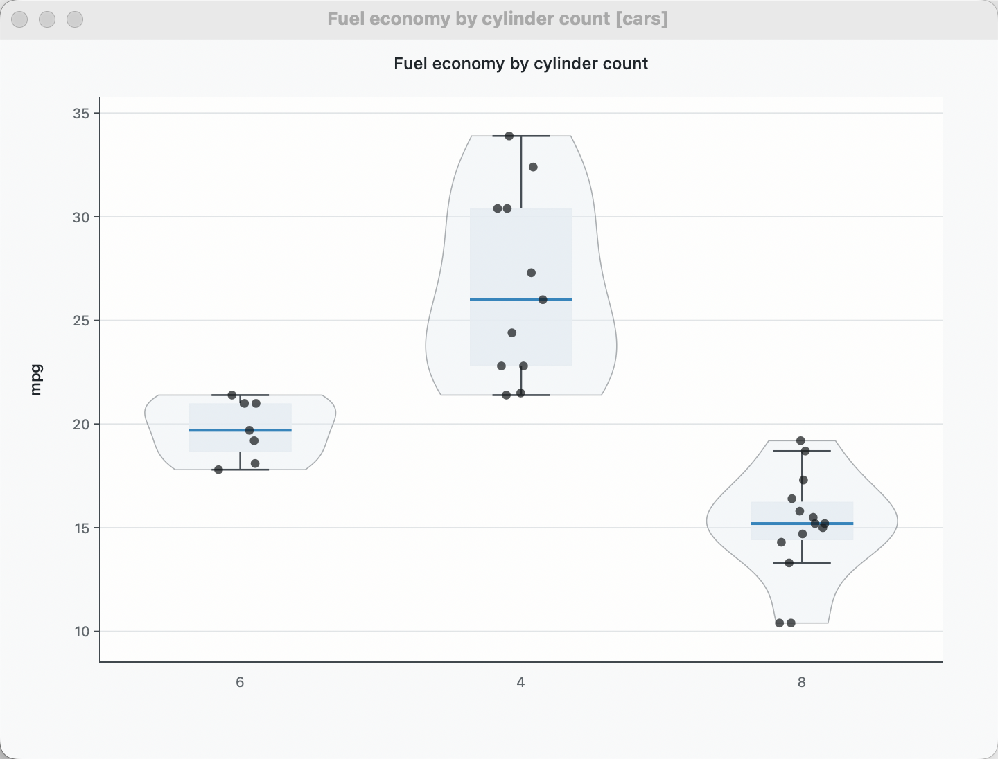
Boxplot…
Native capture ·mtcars: mpg by cyl
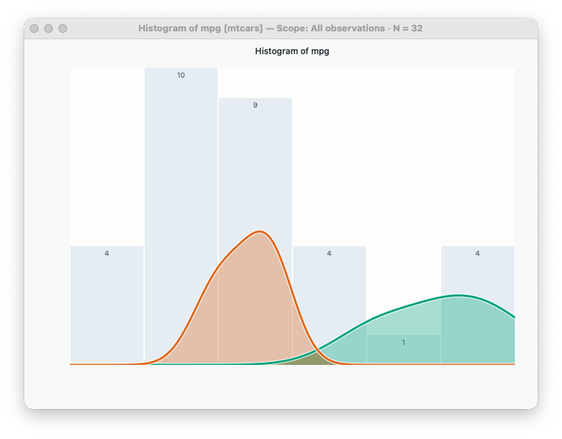
Histogram…
R example ·mtcars: mpg
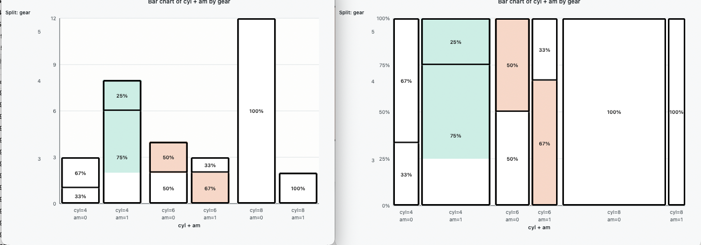
Bar Chart…
R example ·mtcars: cyl
Trellis Plots
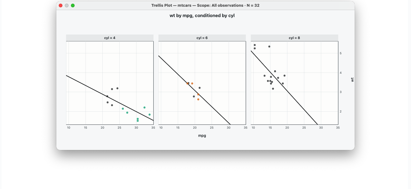
Scatterplot…
mpg × wt · conditioned by cyl
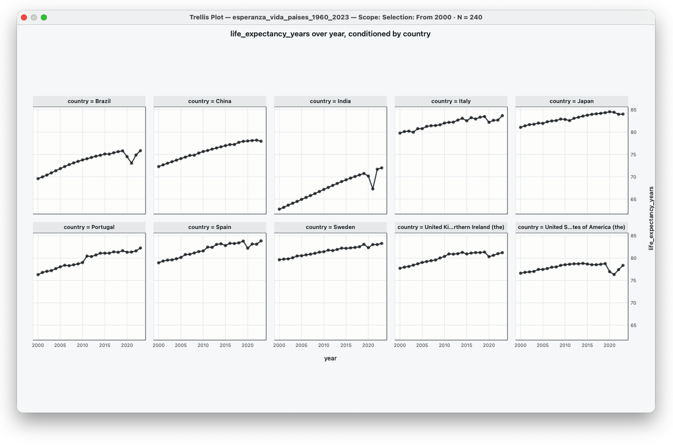
Time Series…
Temp over Day · conditioned by Month
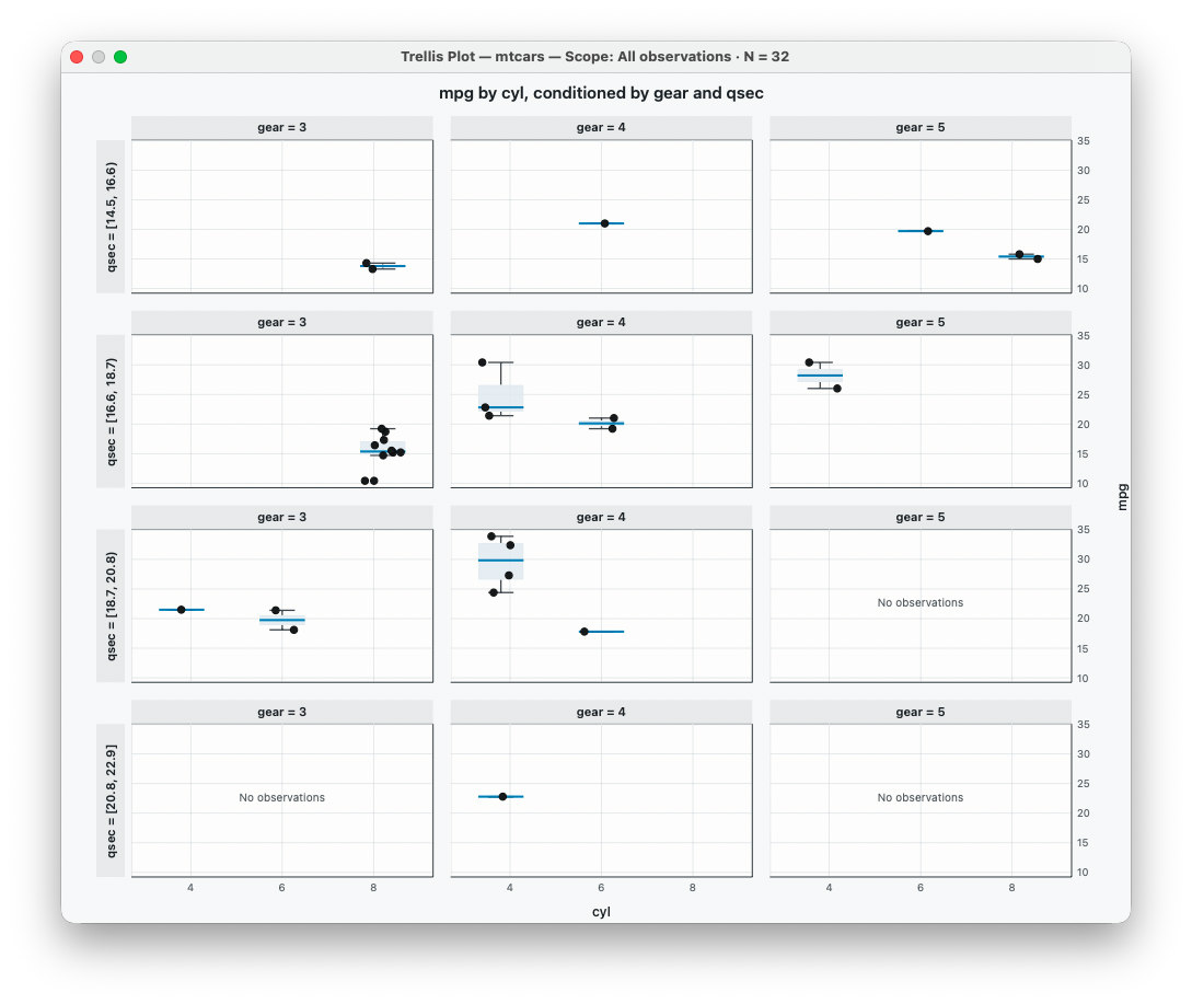
Boxplot…
mpg by cyl · conditioned by am
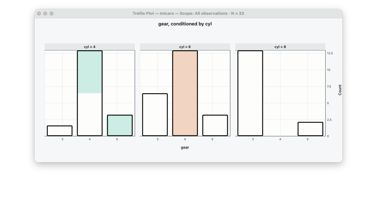
Bar Chart…
cyl counts · conditioned by am
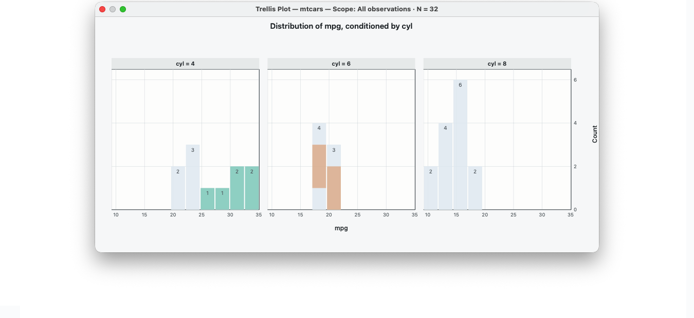
Histogram…
mpg · conditioned by cyl
Interactive demonstrations
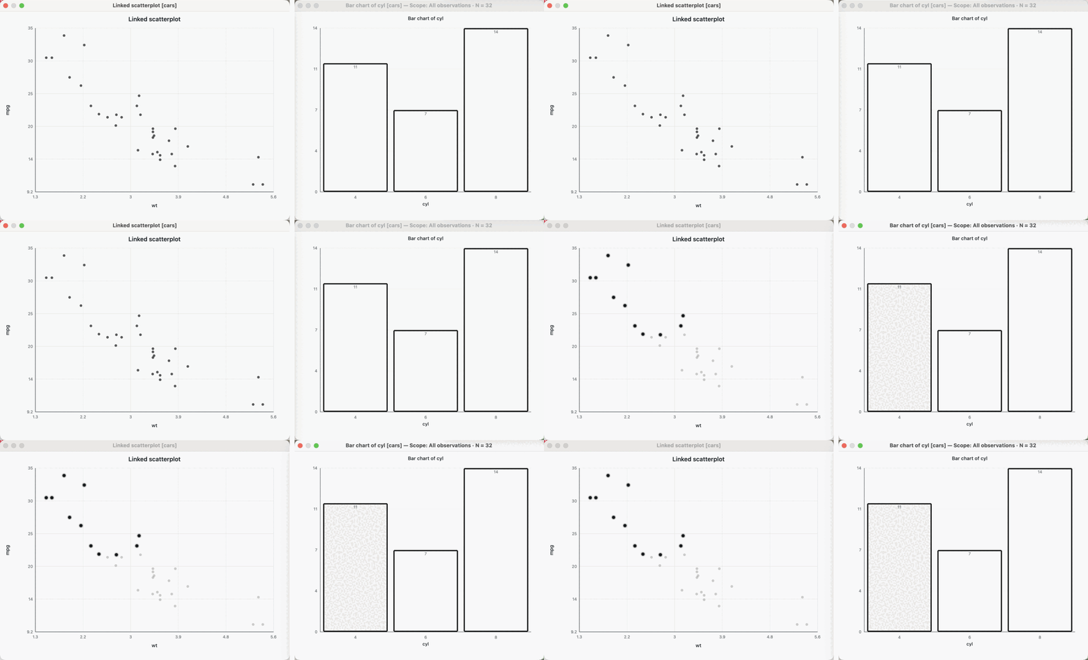
Selection across linked plots
Select a bar → the same cases light up in the scatterplot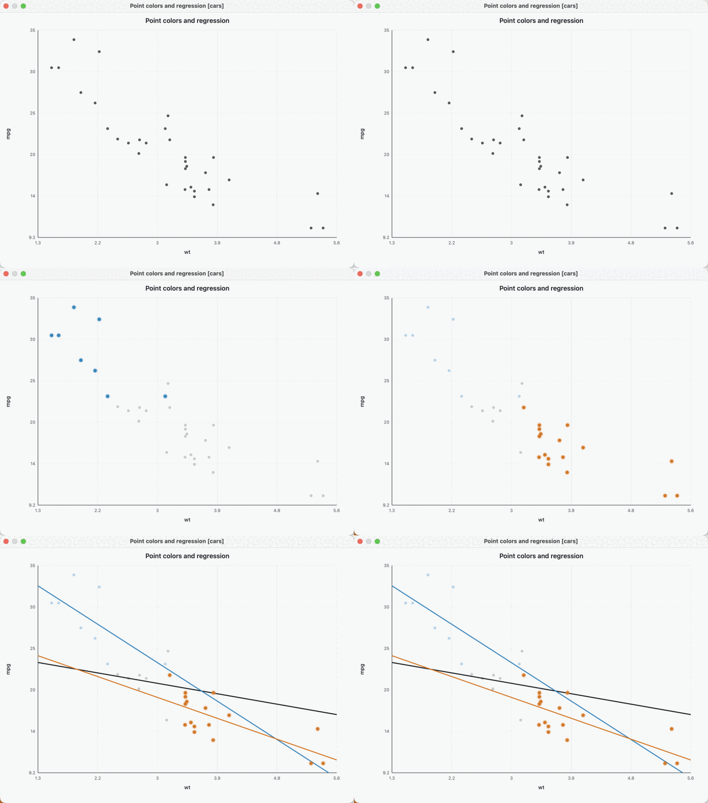
Point colors and regressions
Color selected points → regression by point color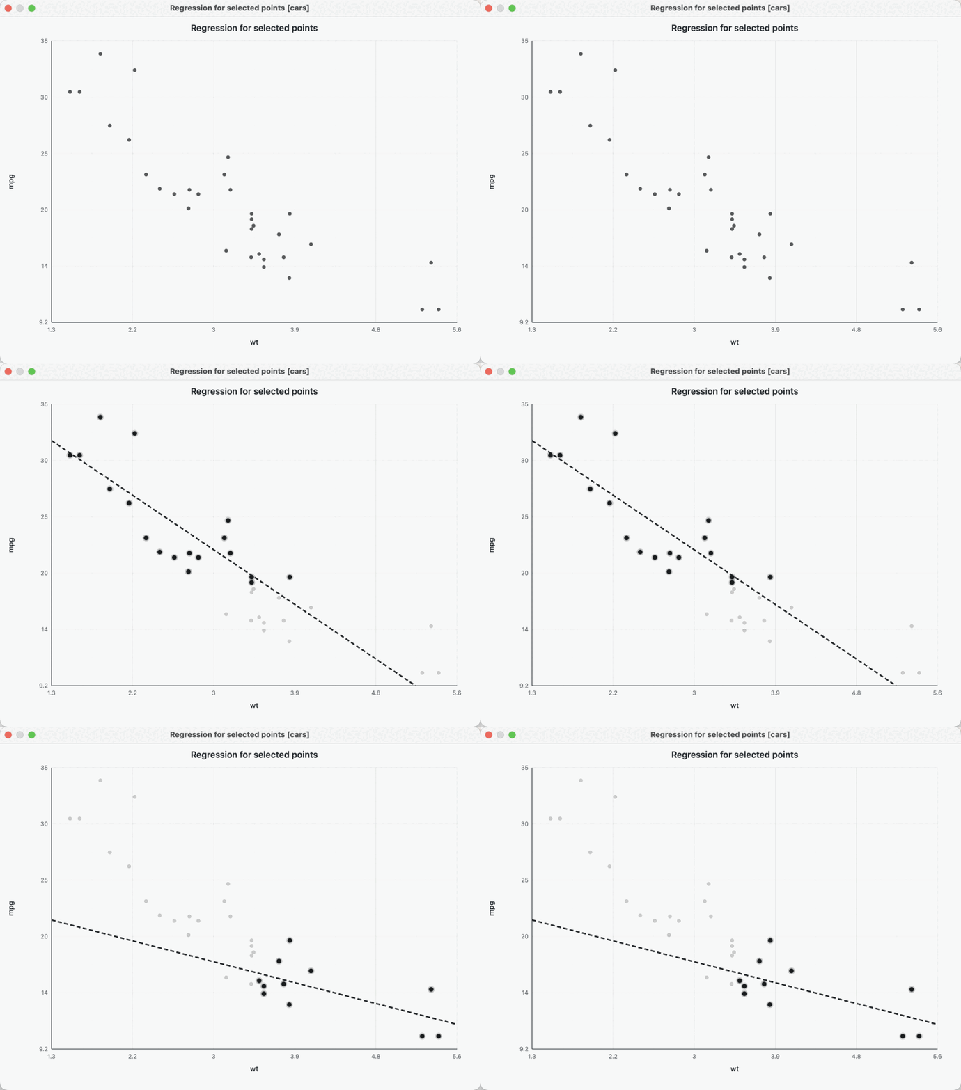
Regression for selected points
Change the selection → the fitted line updates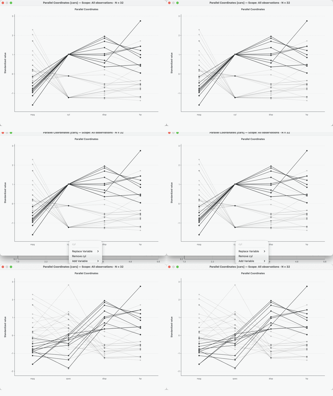
Change a parallel-coordinate variable
Clickcyl → Replace Variable → qsec
Context menu to analysis
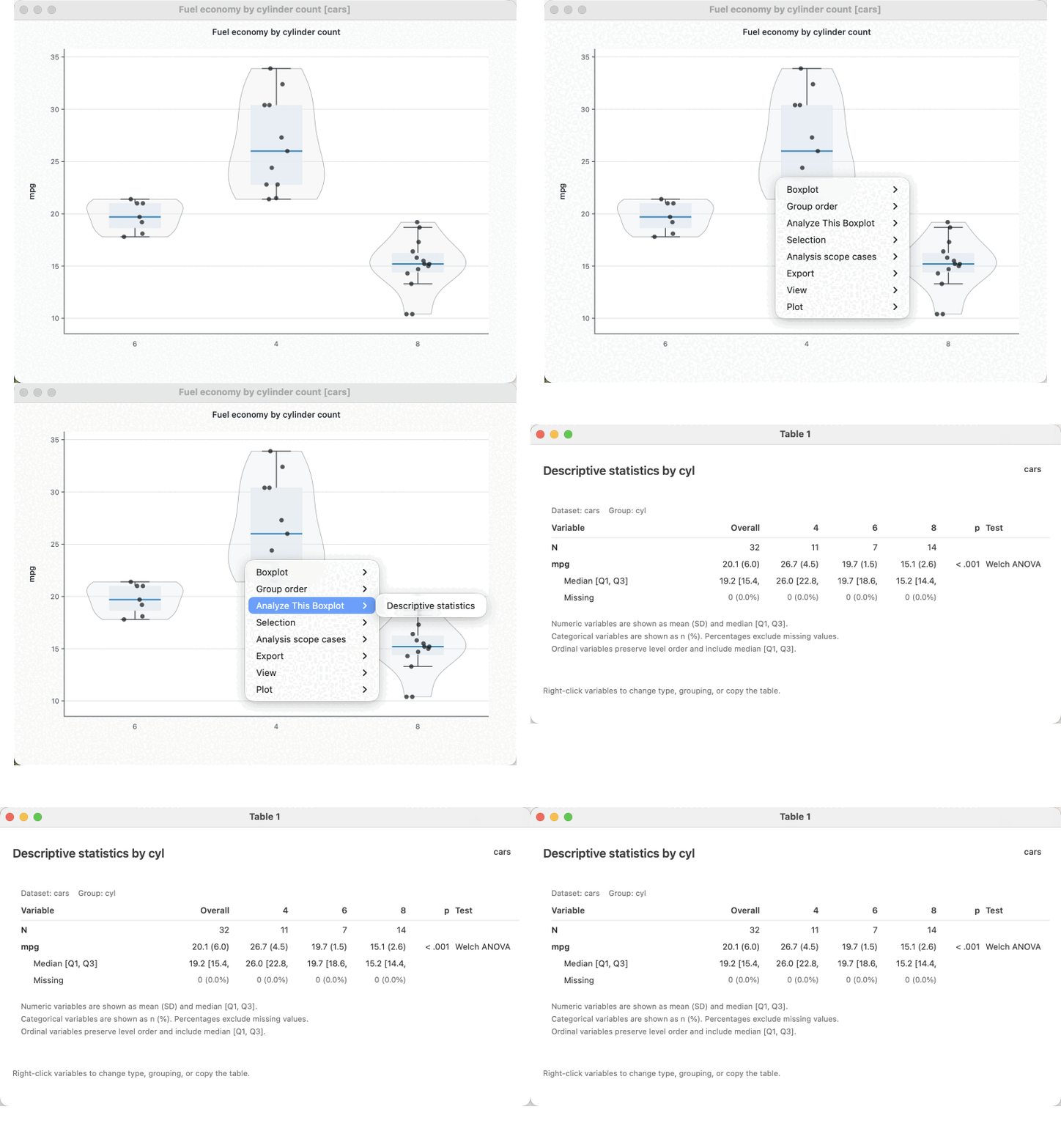
Right-click → Analyze This Boxplot → Descriptive statistics → native Table 1 window.
Linked selection
1Select a point, row or aggregate mark
2LinkEDA retains the original row identities
3Every linked view redraws the same cases